Devlog Day 3 & Changelog!

Today was a bit more research, and a bit less gamedev.
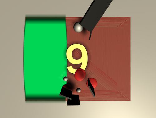
For the score, I really want it to look like the numbers are really engraved into the wood of the cutting board. My first thought was to create a bump map/normal map texture for each number, but that seemed tedious. I spent a while digging into 2014 Unity tutorials on how to create a texture dynamically from text, but I couldn't find anything that worked for me. I also played around with the shader graph for a while but that's still new to me and nothing came out of that. If you know a good way to achieve this, please let me know!
I also figured out when knives fall through the board, but not why (yet!). When a knife is falling onto the left side of the board (for example) and the board is tilted to the left, then it'll fall through. Still gotta find the root cause of this.
Onto the changes!
1. The first thing I changed today was the movement. The cutting board that the ball is on would shake when holding a movement key down, almost as if it were vibrating. I noticed this in Unity, but never in the final build so it wasn't on my radar. Until a friend said that it was really bad for him. Turns out it was an easy fix!
float x = Input.GetAxis("Horizontal") * -rotationForce;// * Time.deltaTime;
float y = Input.GetAxis("Vertical") * rotationForce;// * Time.deltaTime;
I removed the Time.deltaTime multiplier and put the movement into FixedUpdate instead of Update so that it's still the same across framerates. I think the slight differences in Time.deltaTime every frame was making it shake. I played with the rotationForce, and now the game feels as responsive as ever! The cutting board now tilts a bit more, which lets your fruit go extra fast, but also makes it easier to stop your fruit from falling off.
2. Targeting circles, power ups, and the bar that tracks your power up progress are now parented to the cutting board. What this means is that they'll tilt along with the board. I think that this effect just looks nicer for the game. Each of these objects I want to update visually eventually:
- the targeting circles might look nicer as decals on the cutting board
-the bar will move away from the Unity UI slider 'cause that's kinda ugly
-the power up isn't always going to be a sphere, but currently I can't think of anything else. Open to ideas!
3. Also, now when the player is powered up and able to knock away the knives, it should be more obvious. The bar fades through hues, and the cutting board changes texture (currently a random texture from some sample scene).
And that's all for today! A bit shorter than yesterday, but I think I'm figuring out how much work making a game by yourself takes.
I'd appreciate it if you play the game here: https://matthewi.itch.io/spill :)
untitled fruit game prototype
keep your fruit intact by tilting your cutting board to avoid danger and avoid powerups!
More posts
- Devlog 5 & Changelog!May 06, 2020
- Devlog Day 4 and Changelog!May 02, 2020
- Update!Apr 30, 2020
- Untitled Fruit Game Prototype Launch!Apr 29, 2020
Leave a comment
Log in with itch.io to leave a comment.